TEAM
• Luke Bishop - Copywriter/Art Director • Tim Easton - Photographer
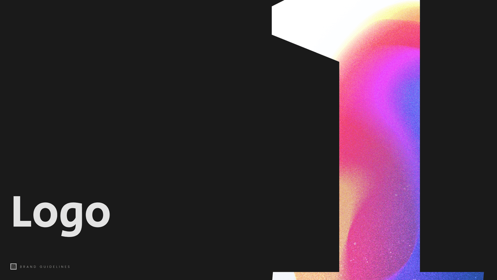
ITM Events – Brand & Digital Transformation
Brand / Web Designer
2024
Repositioning a trusted event production agency with a bold new identity and digital presence.
The Challenge
ITM Events is a respected event production agency known for delivering high-impact experiences for clients like Thames Water, Adidas, Avis and Compass Group.
Despite a stellar track record and decades of word-of-mouth success, their visual identity hadn’t kept pace with the quality of their work.
They needed a brand system that would:
• Reflect their creative ambition and elevate their reputation
• Stand out in a crowded, competitive market
• Support expansion beyond wider UK and Europe
• Help attract and retain high-value, blue-chip clients
The Opportunity
We saw a chance to reposition ITM from “the crew behind the curtain” to creative production partners. The goal was to build a brand that matched the quality of their work — bold, cinematic, and elevated — while remaining practical for digital roll-out and internal use. Bringing their 30 years of services and reputation to the digital age.
Discovery workshop
We ran a workshop with the ITM team to define their brand, persona and value proposition. Through moodboarding, positioning and colour exercises, we gathered insights that shaped the structure and tone of the identity and website.
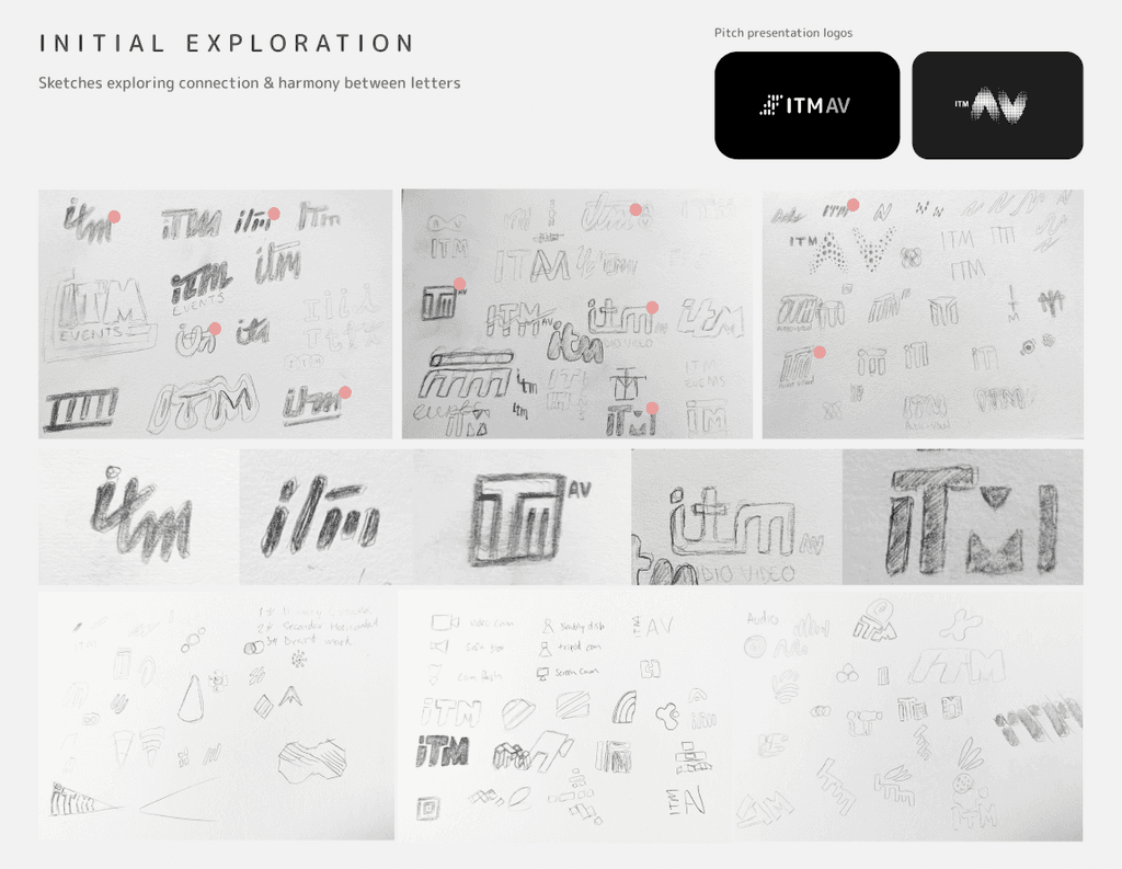
Logo ideation
Before looking outward, I explored shapes and ideas through quick pencil sketches. This helped surface original concepts without external influence and made it easier to identify directions worth developing further.

Visual research
We explored competitor brands and digital trends to identify what could stand out in ITM’s space. This helped us spot gaps, draw inspiration and define a more distinctive visual direction.

Logo refinement
After sketching, we studied competitor brands and digital trends to understand what could cut through the noise. We benchmarked ITM’s position and identified clear opportunities for visual differentiation.
Adding meaning
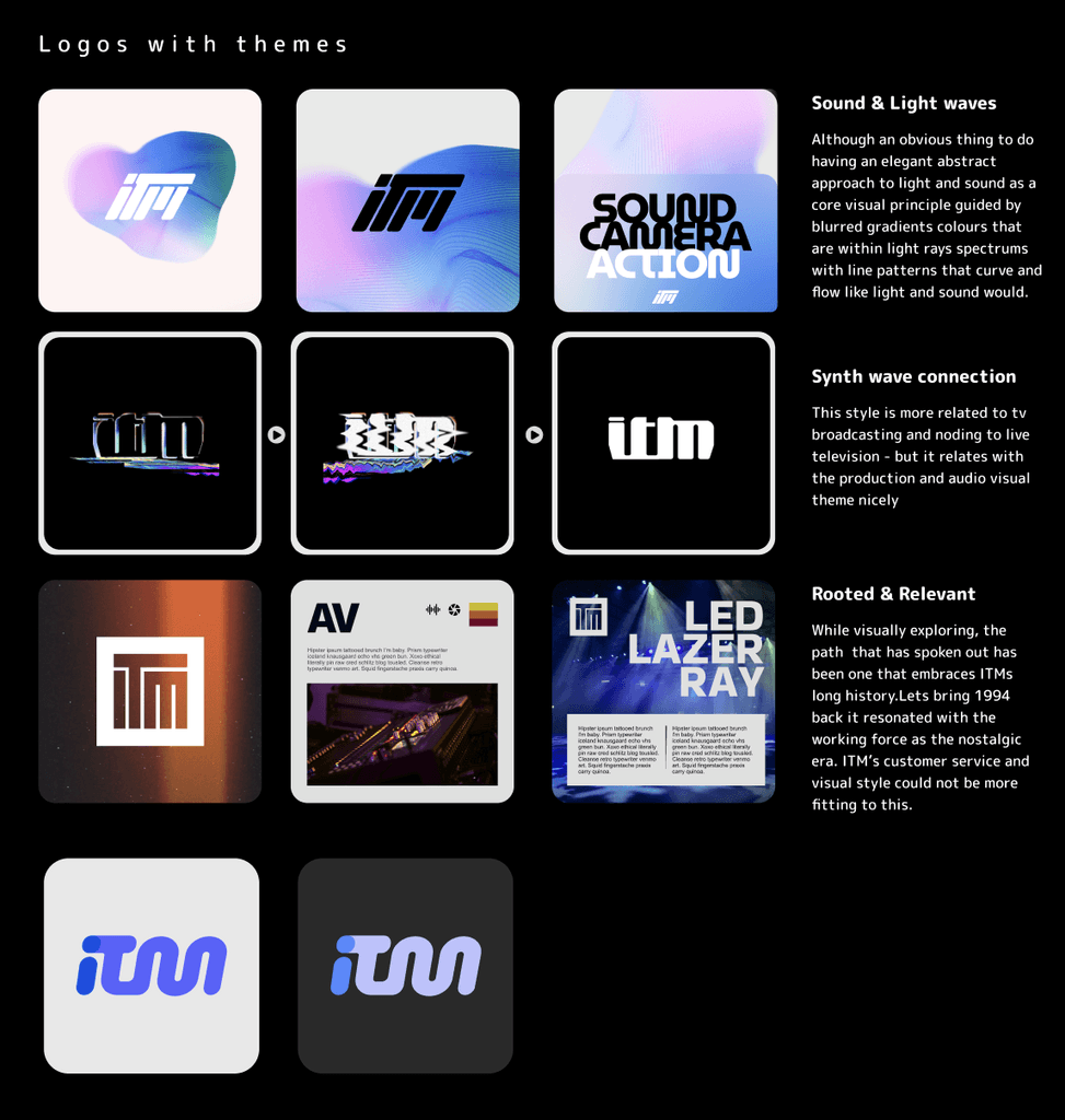
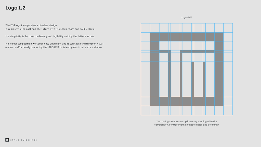
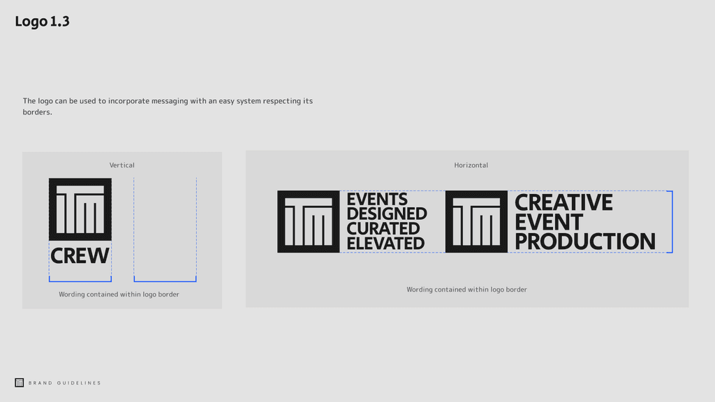
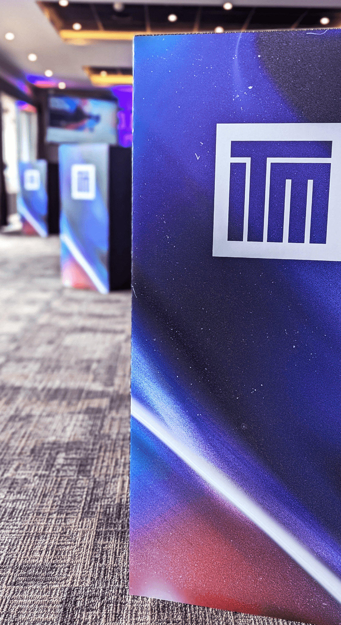
After presenting the research and initial logo scamps, we began refining the logo vectors based on the feedback we received. As the designs took shape, we explored ways to bring more meaning to the ITM letterforms, with a key focus on ensuring the logo communicated ‘events’ more clearly.

Defining concepts
With strong logo directions in place, we started exploring narrative connections. Drawing from workshop themes, we paired ideas with logos that shared similar forms, adding an intentional layer of meaning to the brand system.
Wireframing the UX
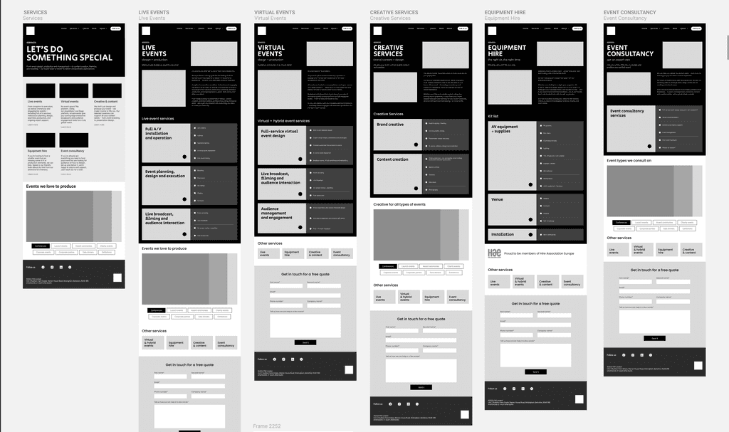
With a clear direction chosen, we started structuring the site. Using insights from the workshops, we built modular wireframes that organised ITM’s services and helped shape a smooth and purposeful user journey.
Component and
UI design
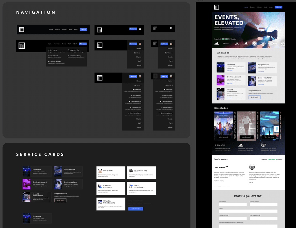
In Figma, I created flexible components to bring the design system to life. This revealed areas needing new content, leading to plans for custom photography and additional brand assets to elevate the experience.
Creating animated patterns
To energise the darker palette, I designed animated patterns that introduced colour and motion across the site. These helped add contrast, create separation and reinforce the dynamic nature of the brand.
This portfolio is under NDA for several projects,
I appreciate your discretion in viewing it.
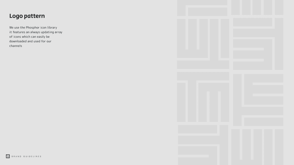
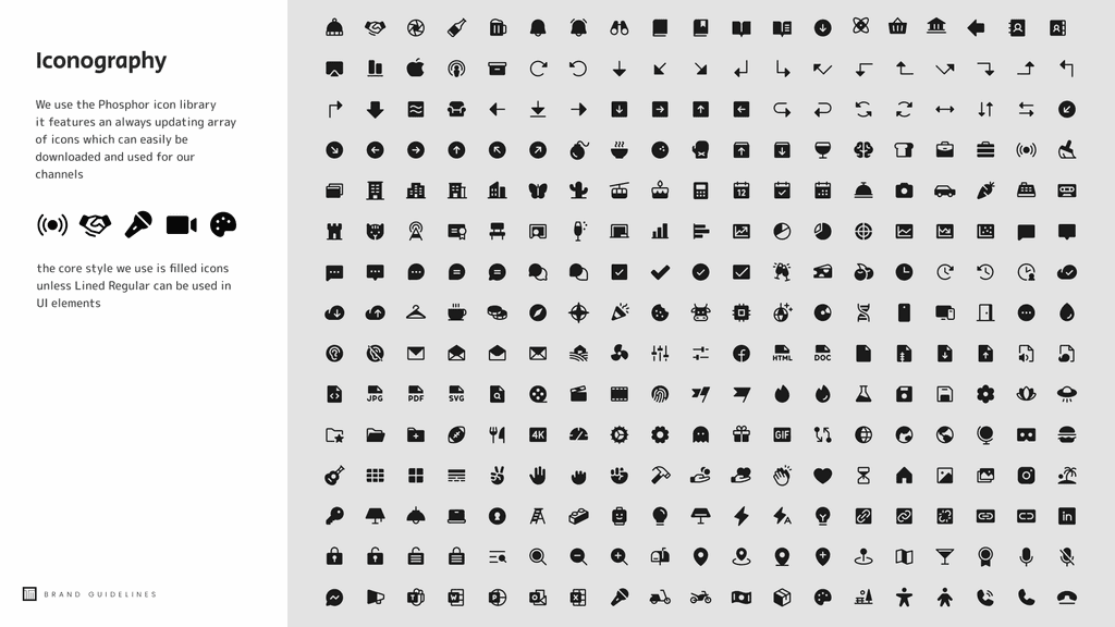
This Website was designed in Figma and built in Framer. Icon attributed to Phosphor Library.
Designed by rzrgraphics ltd 2024
ITM Events – Brand &
Digital Transformation
Repositioning a trusted event production agency with a bold new identity and digital presence.
Brand / Web Designer
2022 - 2023
TEAM
• Luke Bishop - Copywriter/Art Director
• Tim Easton - Photographer
Brand / Web Designer
2024
ITM Events – Brand & Digital Transformation
Repositioning a trusted event production agency with a bold new identity and digital presence.
TEAM
• Luke Bishop - Copywriter/Art Director • Tim Easton - Photographer
The Challenge
ITM Events is a respected event production agency known for delivering high-impact experiences for clients like Thames Water, Adidas, Avis and Compass Group.
Despite a stellar track record and decades of word-of-mouth success, their visual identity hadn’t kept pace with the quality of their work.
They needed a brand system that would:
• Reflect their creative ambition and elevate their reputation
• Stand out in a crowded, competitive market
• Support expansion beyond wider UK and Europe
• Help attract and retain high-value, blue-chip clients
The Opportunity
The Opportunity
We saw a chance to reposition ITM from “the crew behind the curtain” to creative production partners. The goal was to build a brand that matched the quality of their work — bold, cinematic, and elevated — while remaining practical for digital roll-out and internal use. Bringing their 30 years of services and reputation to the digital age.
The process
The Process
Discovery workshop
We ran a workshop with the ITM team to define their brand, persona and value proposition. Through moodboarding, positioning and colour exercises, we gathered insights that shaped the structure and tone of the identity and website.
Logo ideation
Before looking outward, I explored shapes and ideas through quick pencil sketches. This helped surface original concepts without external influence and made it easier to identify directions worth developing further.
Visual research
We explored competitor brands and digital trends to identify what could stand out in ITM’s space. This helped us spot gaps, draw inspiration and define a more distinctive visual direction.
Logo refinement
After sketching, we studied competitor brands and digital trends to understand what could cut through the noise. We benchmarked ITM’s position and identified clear opportunities for visual differentiation.
Adding meaning
After presenting the research and initial logo scamps, we began refining the logo vectors based on the feedback we received. As the designs took shape, we explored ways to bring more meaning to the ITM letterforms, with a key focus on ensuring the logo communicated ‘events’ more clearly.
Defining concepts
With strong logo directions in place, we started exploring narrative connections. Drawing from workshop themes, we paired ideas with logos that shared similar forms, adding an intentional layer of meaning to the brand system.
Wireframing the UX
With a clear direction chosen, we started structuring the site. Using insights from the workshops, we built modular wireframes that organised ITM’s services and helped shape a smooth and purposeful user journey.
Component and
UI design
In Figma, I created flexible components to bring the design system to life. This revealed areas needing new content, leading to plans for custom photography and additional brand assets to elevate the experience.
Creating animated patterns
To energise the darker palette, I designed animated patterns that introduced colour and motion across the site. These helped add contrast, create separation and reinforce the dynamic nature of the brand.
Elevating Events, Celebrating People
Elevating Events,
Celebrating People
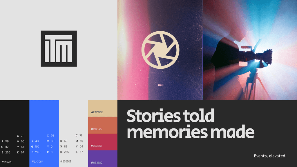
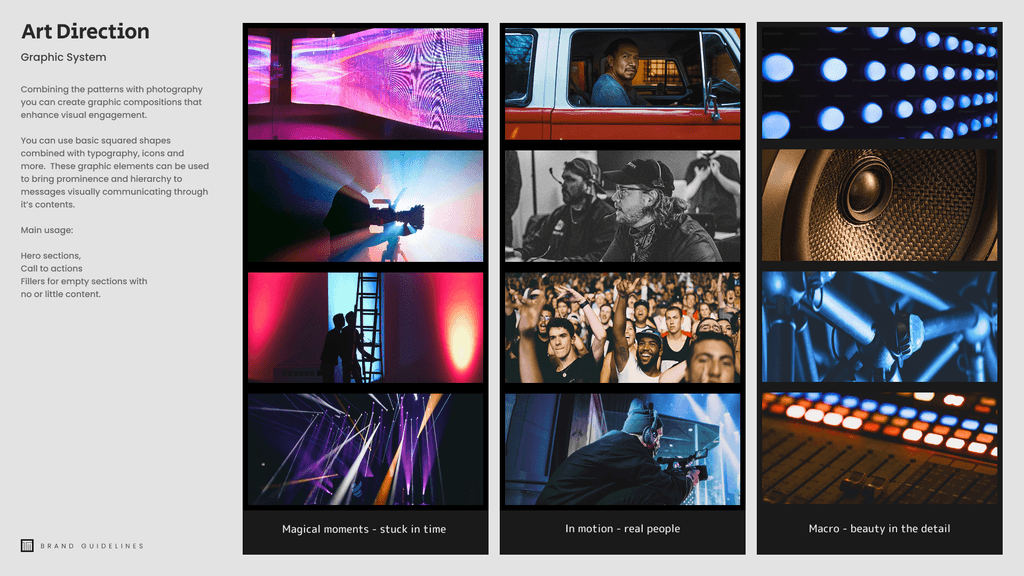
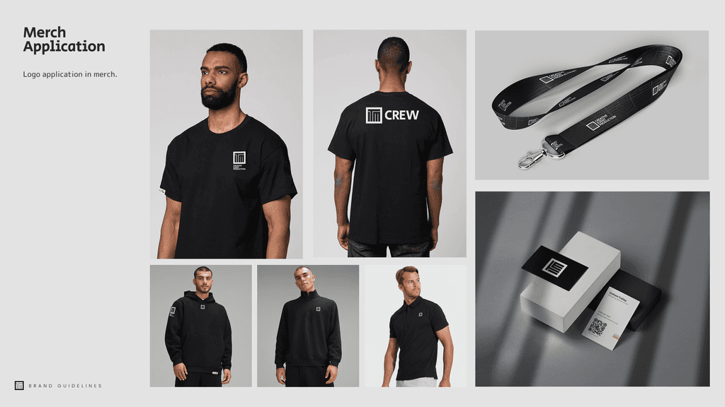
Bringing the ITM brand to life was a true labour of love. I spent the summer deconstructing their old identity and rebuilding it from the ground up, testing fabrics for custom uniforms, directing three photoshoots, and obsessing over every detail. Our new visual system featuring grainy film-burn gradients, bold typography, and candid, people-first photography, captures both the atmospheric scale of their work and the authenticity of their team. From the sleek UI of the website to the custom high-vis jackets, every touchpoint now reflects ITM’s dual strengths: extraordinary event expertise and a culture that goes above and beyond.
The designs I meticulously crafted showcased the UI knowledge I acquired during a 12-week period of intensive learning.
The Memorisely bootcamp provided one of the best learning experiences, instilling in me a newfound confidence in Figma and best practices. Under the guidance of industry expert Zander Whitehurst, I learned how to work end-to-end, from research and defining the brief to execution, prototyping, and handover to development. Additionally,
I honed my skills in creating robust design systems and libraries, optimizing my efficiency in a SUPA-FAST manner!
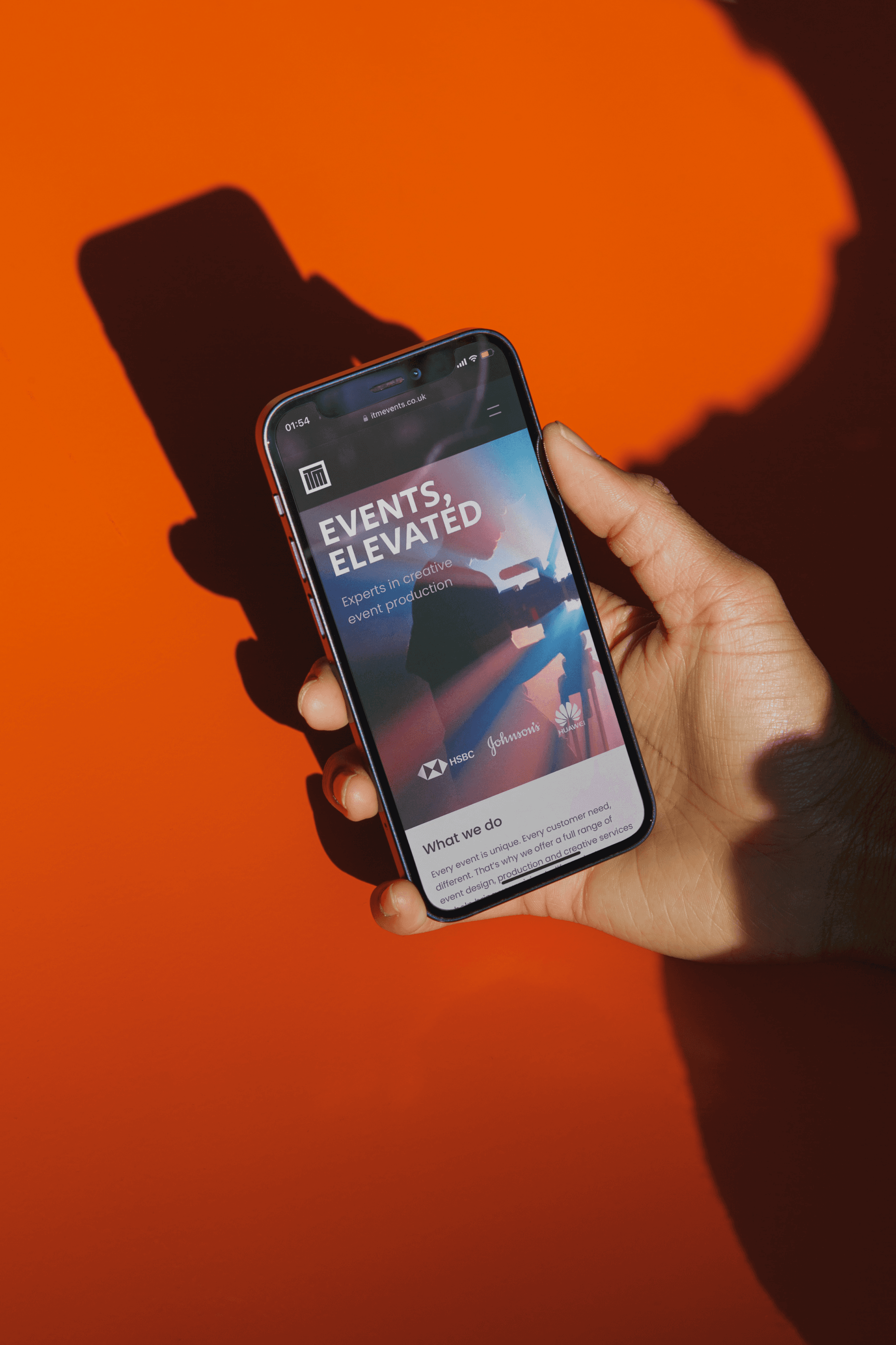
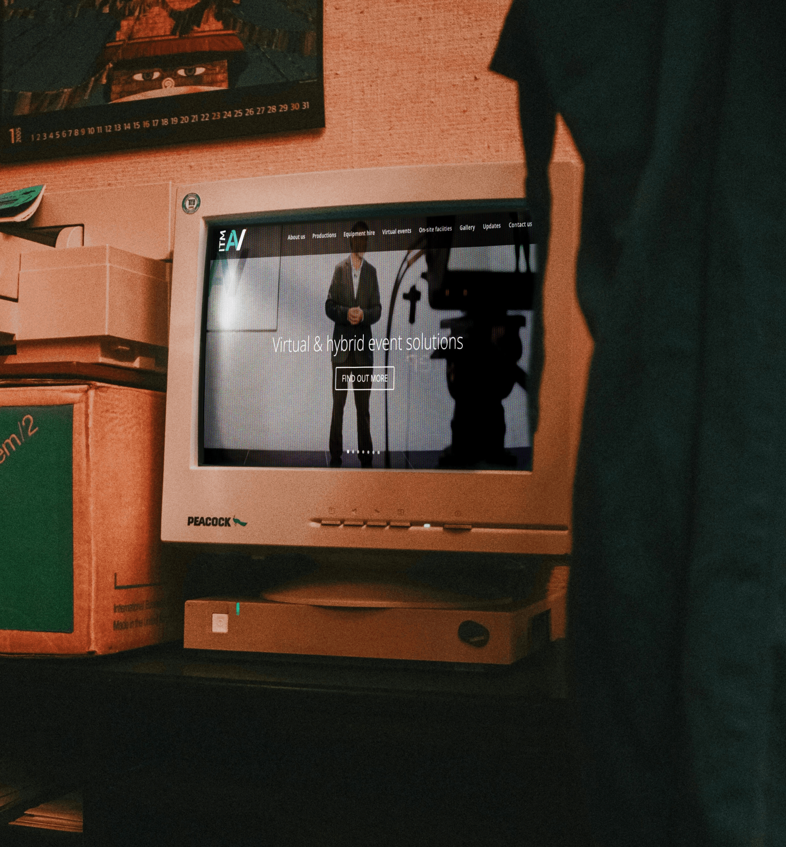
The one month website
The one month website
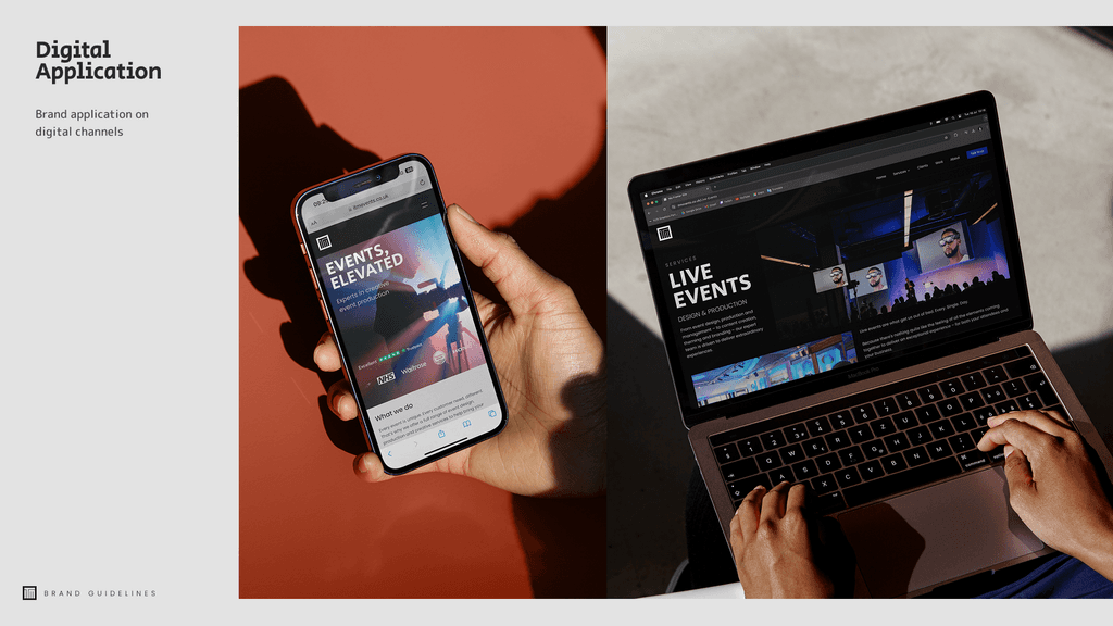
With the brand foundations set, we designed and shipped a site in 30 days that puts clarity, proof and conversion first. We began by rewriting the information architecture so services are simple and paired with the audiences they serve, which shaped every layout. The UI uses a confident typography scale, a calm neutral base and film burn gradients with subtle grain as accents, while candid photography of the team adds warmth and credibility. A modular system drives the build, with a responsive grid, reusable capability cards, case study tiles, testimonials and a rolling client logo reel, plus sticky enquiry surfaces and clear hover, focus and loading states. Motion is purposeful and supports reading. Accessibility and performance are baked in with high contrast text, logical headings, descriptive alt text and optimised media. Built in Framer, the system is powered by style tokens so ITM can edit colour, typography and copy and add new services and case studies without help. The shop window is complete and ready to grow.
With the brand foundations set, we designed and shipped a site in 30 days that puts clarity, proof and conversion first. We began by rewriting the information architecture so services are simple and paired with the audiences they serve, which shaped every layout.
The UI uses a confident typography scale, a calm neutral base and film burn gradients with subtle grain as accents, while candid photography of the team adds warmth and credibility. A modular system drives the build, with a responsive grid, reusable capability cards, case study tiles, testimonials and a rolling client logo reel, plus sticky enquiry surfaces and clear hover, focus and loading states.
Motion is purposeful and supports reading. Accessibility and performance are baked in with high contrast text, logical headings, descriptive alt text and optimised media. Built in Framer, the system is powered by style tokens so ITM can edit colour, typography and copy and add new services and case studies without help. The shop window is complete and ready to grow.


Brand-Driven Transformation
Brand-Driven Transformation
Many businesses view branding and marketing as luxuries, afterthoughts reserved for those with big budgets and guaranteed returns. Limited access to design talent and high upfront costs make brand work feel like a risky investment.
When ITM chose to partner with us, they did so from a place of trust. Their owner set ego aside and put clients and employees first, focusing on how to communicate their story most effectively.
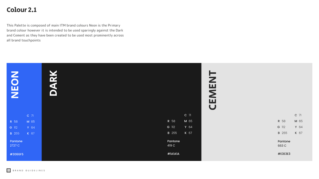
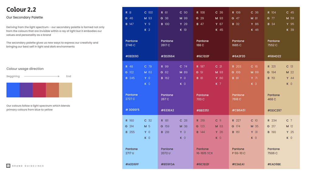
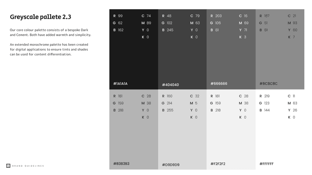
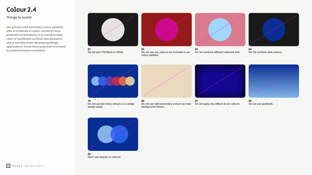
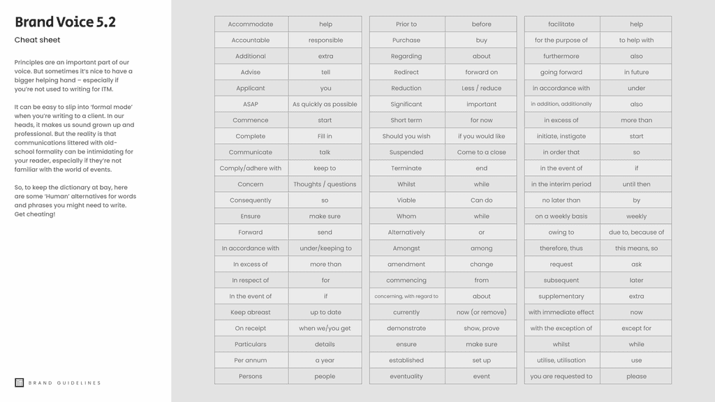
Our brand guidelines mirror that mindset. Instead of rigid rules, we delivered a flexible framework, guides not gatekeepers, that any team member can use to keep the brand alive and evolving. By combining color, typography and imagery in open ended ways, ITM can maintain design quality even without an in house designer on every project.
Many businesses view branding and marketing as luxuries, afterthoughts reserved for those with big budgets and guaranteed returns. Limited access to design talent and high upfront costs make brand work feel like a risky investment.
When ITM chose to partner with us, they did so from a place of trust. Their owner set ego aside and put clients and employees first, focusing on how to communicate their story most effectively.
Our brand guidelines mirror that mindset. Instead of rigid rules, we delivered a flexible framework, guides not gatekeepers, that any team member can use to keep the brand alive and evolving. By combining color, typography and imagery in open ended ways, ITM can maintain design quality even without an in house designer on every project.
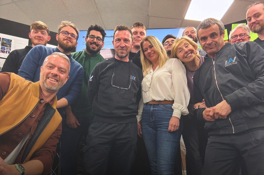
Hosting a winning launch day
Hosting a winning launch day
With the work wrapped, we swapped Figma for fizz and took the new ITM brand to Newbury Racecourse. We hosted a launch for clients, prospects, partners and suppliers, and around 100 people turned up in August. We walked everyone through the site, showed the identity in the wild and had a proper chat about where ITM is heading.
With the work wrapped, we swapped Figma for fizz and took the new ITM brand to Newbury Racecourse. We hosted a launch for clients, prospects, partners and suppliers, and around 100 people turned up in August. We walked everyone through the site, showed the identity in the wild and had a proper chat about where ITM is heading.
The reaction was brilliant. People got the direction straight away and it sparked new conversations, opportunities and partnerships on the spot. No winning horses for me on the day, but we left feeling like winners. I feel lucky to have worked with a team this open to change and ready for what is next.

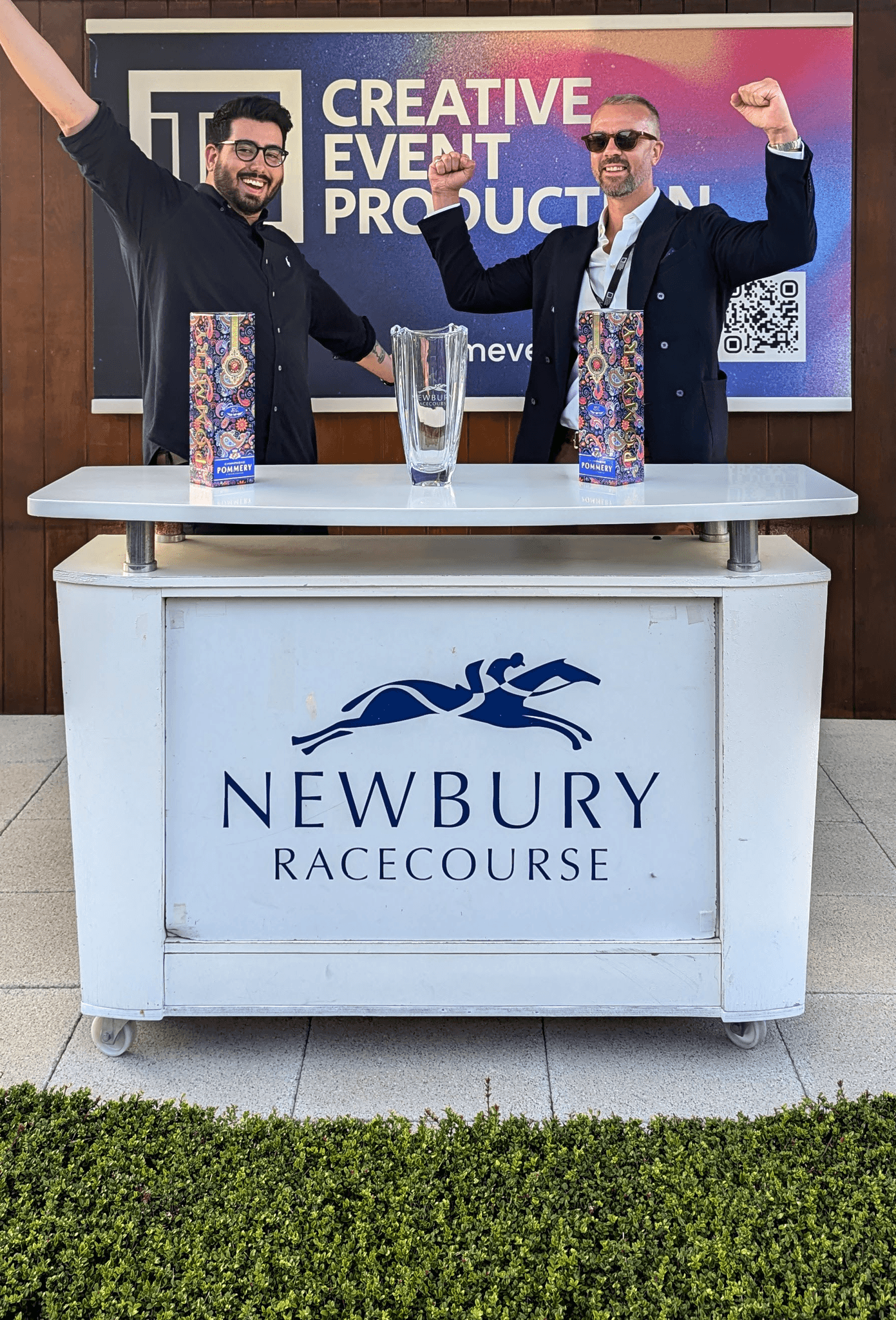


The reaction was brilliant. People got the direction straight away and it sparked new conversations, opportunities and partnerships on the spot. No winning horses for me on the day, but we left feeling like winners. I feel lucky to have worked with a team this open to change and ready for what is next.
This portfolio is under NDA for several projects I'd appreciate your discretion in viewing it.
This Website was designed in Figma and built in Framer. Icon attributed to Phosphor Library.
Designed by rzrgraphics ltd 2024
This portfolio is under NDA for several projects I'd appreciate your discretion in viewing it. This Website was designed in Figma and built in Framer. Icon attributed to Phosphor Library.
Designed by rzrgraphics ltd 2024